
Here is a chart showing the number of crimes against every defined group:

Anti-Jewish hate crimes were 57% of all hate crimes in New York City - 170 out of 300 total.
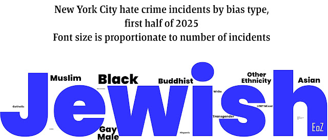
The dashboard provides a word cloud to give an idea of which groups are most affected.


Looks bad - but it is not even close to accurate.
I created a word cloud where the font size is proportionate to the number of incidents, and it gives you a much better idea of how bad antisemitism is in New York City compared to all other bias crimes.

Are you beginning to understand that this is a real problem yet?
If you click on the graphic and zoom in far enough, you can actually read even the tiny ones in the middle of the "H." I had to save it as a very large picture just to allow them to be readable.
|
"He's an Anti-Zionist Too!" cartoon book (December 2024) PROTOCOLS: Exposing Modern Antisemitism (February 2022) |
 |
 Buy
Buy